Note
Go to the end to download the full example code. or to run this example in your browser via Binder
“Phenotypic Ages” in NHANES Data
This example loads blood exam data from NHANES 2010, calculates “Phenotypic Ages,” and performs survival analyses by phenotypic age.
Loading NHANES 2010 data
from biolearn.load import load_nhanes
year = 2010
df = load_nhanes(year)
df["years_until_death"] = df["months_until_death"] / 12
Calculate “biological age” based on PhenotypicAge
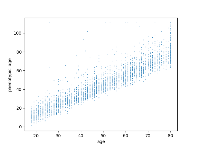
Show relation between biological age and chronological age
import seaborn as sn
sn.scatterplot(data=df,x="age", y="phenotypic_age",s=2);
<Axes: xlabel='age', ylabel='phenotypic_age'>
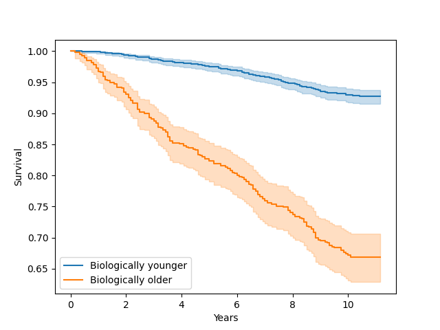
Plot survival curve for people with accelerated aging (older biological age) vs decelerated aging (younger biological age)
import matplotlib.pyplot as plt
from lifelines import KaplanMeierFitter
df["biologically_older"] = df["phenotypic_age"] > df["age"]
ax = plt.subplot()
groups = df["biologically_older"]
ix = groups == 0
T = df.years_until_death
E = df.is_dead
kmf = KaplanMeierFitter()
kmf.fit(T[ix], E[ix], label="Biologically younger")
ax = kmf.plot_survival_function(ax=ax)
kmf.fit(T[~ix], E[~ix], label="Biologically older")
ax = kmf.plot_survival_function()
plt.ylabel("Survival")
plt.xlabel("Years");
Text(0.5, 23.52222222222222, 'Years')
Total running time of the script: (0 minutes 14.225 seconds)
Estimated memory usage: 136 MB